Appearance
Layout
Master-detail layout with tabs
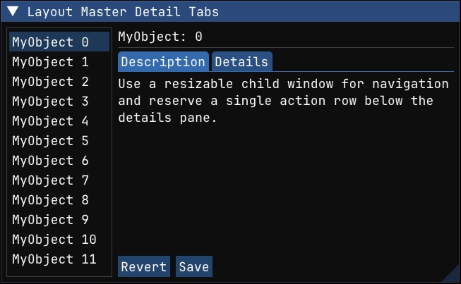
Build a resizable master-detail layout with a child list on the left and tabs on the right.
This follows the same general pattern as the Dear ImGui demo's simple layout example: a left child window is used for navigation, same_line() places a grouped detail pane beside it, and the right side reserves its bottom row for actions by giving the inner child a height of -get_frame_height_with_spacing(). The result is a compact application-style layout rather than a one-off arrangement of widgets.
python
def layout_master_detail_tabs(state: LayoutState):
    imgui.begin_child("left pane", (150, 0), imgui.ChildFlags.BORDERS | imgui.ChildFlags.RESIZE_X)
    for i in range(12):
        if imgui.selectable(f"MyObject {i}", state.selected == i, imgui.SelectableFlags.SELECT_ON_NAV)[0]:
            state.selected = i
    imgui.end_child()

    imgui.same_line()

    imgui.begin_group()
    imgui.begin_child("item view", (0, -imgui.get_frame_height_with_spacing()))
    imgui.text(f"MyObject: {state.selected}")
    imgui.separator()
    if imgui.begin_tab_bar("##details-tabs"):
        if imgui.begin_tab_item("Description")[0]:
            imgui.text_wrapped(
                "Use a resizable child window for navigation and reserve a single action row below the details pane."
            )
            imgui.end_tab_item()
        if imgui.begin_tab_item("Details")[0]:
            imgui.text("ID: 0123456789")
            imgui.text("Status: Ready")
            imgui.end_tab_item()
        imgui.end_tab_bar()
    imgui.end_child()

    if imgui.button("Revert"):
        pass
    imgui.same_line()
    if imgui.button("Save"):
        pass
    imgui.end_group()
Item width patterns
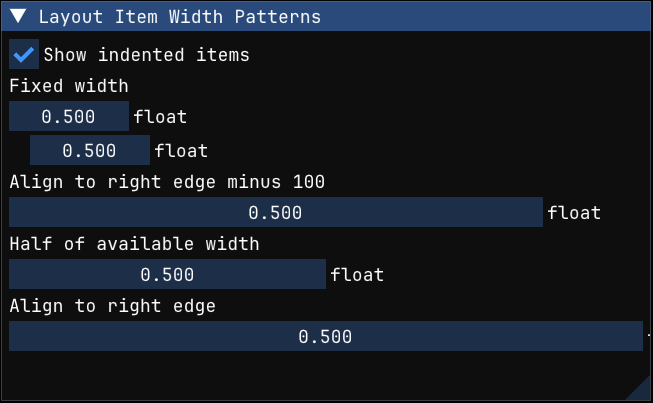
Use push_item_width() with fixed, right-aligned, and proportional widths.
This recipe demonstrates the width patterns from the Dear ImGui demo: a fixed pixel width, a width aligned against the right edge using a negative value, a width derived from get_content_region_avail(), and the -FLT_MIN idiom for "fill until the right edge". These patterns are the building blocks for forms that need to stay readable while the window is resized.
python
def layout_item_width_patterns(state: WidthState):
    _changed, state.show_indented = imgui.checkbox("Show indented items", state.show_indented)

    imgui.text("Fixed width")
    imgui.push_item_width(120)
    _changed, state.value = imgui.drag_float("float##fixed", state.value, 0.01, 0.0, 1.0)
    if state.show_indented:
        imgui.indent()
        _changed, state.value = imgui.drag_float("float##fixed-indented", state.value, 0.01, 0.0, 1.0)
        imgui.unindent()
    imgui.pop_item_width()

    imgui.text("Align to right edge minus 100")
    imgui.push_item_width(-100)
    _changed, state.value = imgui.drag_float("float##right-minus-100", state.value, 0.01, 0.0, 1.0)
    imgui.pop_item_width()

    imgui.text("Half of available width")
    imgui.push_item_width(imgui.get_content_region_avail()[0] * 0.5)
    _changed, state.value = imgui.drag_float("float##half-width", state.value, 0.01, 0.0, 1.0)
    imgui.pop_item_width()

    imgui.text("Align to right edge")
    imgui.push_item_width(-imgui.FLT_MIN)
    _changed, state.value = imgui.drag_float("float##fill-right", state.value, 0.01, 0.0, 1.0)
    imgui.pop_item_width()
Group sizing
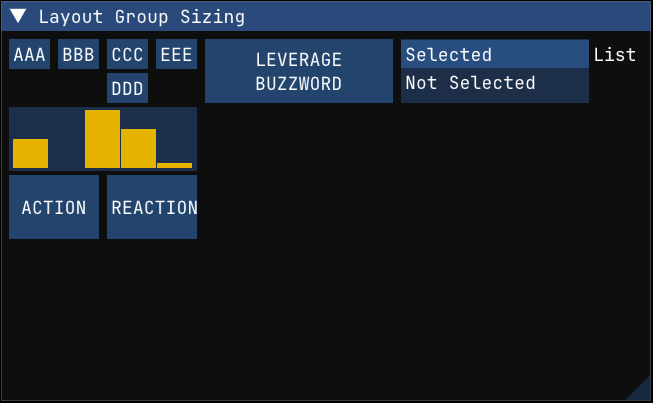
Capture a group's size and reuse it to size related widgets beside it.
begin_group() / end_group() lets multiple items behave like one logical item for layout. This example measures the first grouped block with get_item_rect_size() and then reuses that size for a histogram, two action buttons, and a list box beside it. The pattern is useful when different widget types should share one visual footprint without hard-coding pixel sizes for each one separately.
python
def layout_group_sizing(state: GroupSizingState):
    imgui.begin_group()
    imgui.begin_group()
    imgui.button("AAA")
    imgui.same_line()
    imgui.button("BBB")
    imgui.same_line()
    imgui.begin_group()
    imgui.button("CCC")
    imgui.button("DDD")
    imgui.end_group()
    imgui.same_line()
    imgui.button("EEE")
    imgui.end_group()
    imgui.set_item_tooltip("First group hovered")

    group_size = imgui.get_item_rect_size()
    imgui.plot_histogram(
        "##values",
        np.array([0.5, 0.2, 0.8, 0.6, 0.25], dtype=np.float32),
        graph_size=group_size,
    )

    half_width = (group_size[0] - imgui.get_style().item_spacing[0]) * 0.5
    imgui.button("ACTION", (half_width, group_size[1]))
    imgui.same_line()
    imgui.button("REACTION", (half_width, group_size[1]))
    imgui.end_group()

    imgui.same_line()
    imgui.button("LEVERAGE\nBUZZWORD", group_size)
    imgui.same_line()

    labels = ["Selected", "Not Selected"]
    if imgui.begin_list_box("List", group_size):
        for idx, label in enumerate(labels):
            if imgui.selectable(label, state.selection == idx)[0]:
                state.selection = idx
        imgui.end_list_box()
Horizontal layout with same_line()
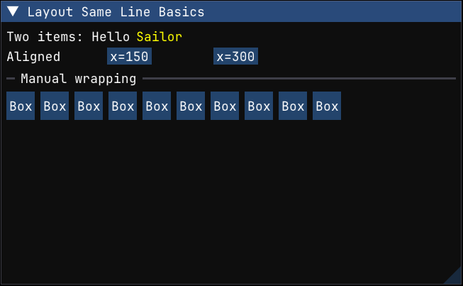
Use same_line() to keep multiple items on one row instead of advancing to a new line after every widget.
This example covers three common horizontal layout patterns: placing text and buttons on the same row, using explicit x-offsets for simple aligned columns, and manually wrapping a row of buttons when there is no longer enough room to keep adding items on the current line.
python
def layout_same_line_basics():
    imgui.text("Two items: Hello")
    imgui.same_line()
    imgui.text_colored((1.0, 1.0, 0.0, 1.0), "Sailor")

    imgui.text("Aligned")
    imgui.same_line(150)
    imgui.small_button("x=150")
    imgui.same_line(300)
    imgui.small_button("x=300")

    imgui.separator_text("Manual wrapping")
    button_size = (40, 40)
    right_edge = imgui.get_cursor_screen_pos()[0] + imgui.get_content_region_avail()[0]
    spacing_x = imgui.get_style().item_spacing[0]
    for i in range(10):
        imgui.push_id(i)
        imgui.button("Box", button_size)
        next_x2 = imgui.get_item_rect_max()[0] + spacing_x + button_size[0]
        if i + 1 < 10 and next_x2 < right_edge:
            imgui.same_line()
        imgui.pop_id()
Text baseline alignment
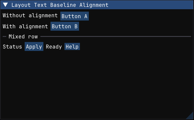
Use align_text_to_frame_padding() when a line starts with text and is followed by framed widgets.
Plain text and framed controls do not naturally share the same baseline. This recipe shows the common fix: call align_text_to_frame_padding() before the text item so that labels, buttons, and other controls sit on the same visual row more cleanly.
python
def layout_text_baseline_alignment():
    imgui.text("Without alignment")
    imgui.same_line()
    imgui.button("Button A")

    imgui.align_text_to_frame_padding()
    imgui.text("With alignment")
    imgui.same_line()
    imgui.button("Button B")

    imgui.separator_text("Mixed row")
    imgui.align_text_to_frame_padding()
    imgui.text("Status")
    imgui.same_line()
    imgui.button("Apply")
    imgui.same_line()
    imgui.text("Ready")
    imgui.same_line()
    imgui.small_button("Help")
Basic tab bar
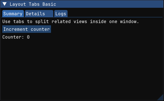
Build a small tabbed interface with begin_tab_bar() and begin_tab_item().
Tabs are submitted every frame like the rest of the ImGui UI. The important pattern is to start the tab bar, submit each tab item, render the contents only when that tab item is active, and then end both the tab item and the tab bar.
python
def layout_tabs_basic(state: TabsState):
    if imgui.begin_tab_bar("##demo-tabs"):
        if imgui.begin_tab_item("Summary")[0]:
            imgui.text_wrapped("Use tabs to split related views inside one window.")
            if imgui.button("Increment counter"):
                state.counter += 1
            imgui.text(f"Counter: {state.counter}")
            imgui.end_tab_item()

        visible, state.closable_details = imgui.begin_tab_item("Details", state.closable_details)
        if visible:
            imgui.text("A tab can manage its own open state.")
            imgui.checkbox("Enable option", True)
            imgui.end_tab_item()

        if imgui.begin_tab_item("Logs")[0]:
            imgui.text("Render the tab contents only when the tab is selected.")
            imgui.bullet_text("Build completed")
            imgui.bullet_text("Tests passed")
            imgui.end_tab_item()

        imgui.end_tab_bar()